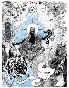
John Pachkowsky provided the art project for our November magazine. Here’s the inside scoop from John and from CiTR/Discorder Art Director Ricky Castanedo-Laredo about the project and the process!
x
From Ricky:
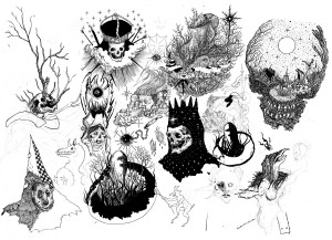
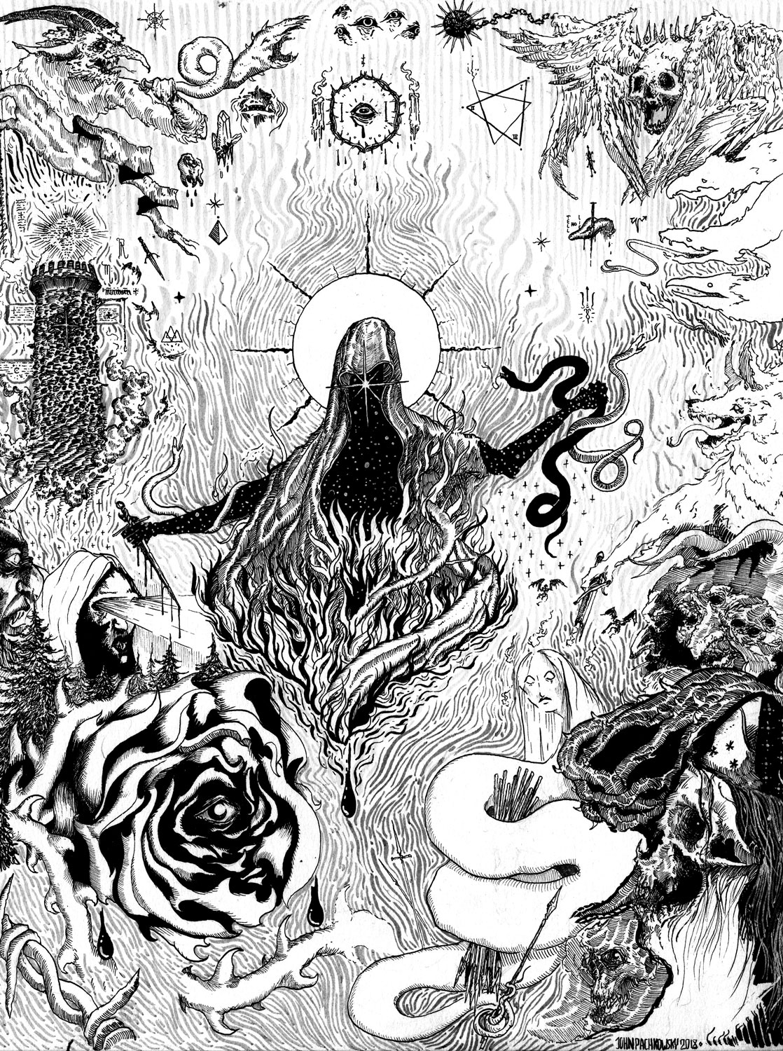
John is an illustrator currently enrolled in the IDEA School of Design in North Vancouver. His illustrations are detailed and meticulous, often drawing from engravings, comics, pulp books, and gothic illustration. Given the nature of his work, it can be incredibly time consuming, so upon reaching out to him to create an Art Project for Discorder Magazine, he and I discussed the idea of doing something a little looser, a little more collaged. The idea came to me when he posted something on his instagram about “doodling” and creating surreal landscapes from just quick ideas that he puts down on paper, without regards to composition of a larger story. I really like the idea of having a very meticulous and intentional illustrator allow himself to exit his own script and work different ideas into a new piece for the magazine. The resulting pieces see Pachkowsky allow the magic of his drawing to be exposed, giving away some of his secret pencils, his unfinished thoughts, his thumbnails, the actual scrawls and doodles that eventually lead to his intricate and dark illustrations.

From John:
Hi! I’m John Pachkowsky, until recently a self-taught Vancouver born and bred illustrator and artist-in-progress. I’m currently studying first year illustration and design at the CapU IDEA program and diving deep into many different mediums, though I’m primarily known for traditional pen & ink work. I can’t resist a good spooky theme (it’s Halloween every day over here) — though I dabble in all kinds of imagery in my work, I’ll always return to my ghoul and ghost roots at the end of the day. Forever on a quest to refine my linework and become an unholy Dore/Durer/Art Goblin chimera. When not in school or the city, I illustrate out of my art dungeon in the far flung reaches of the dark woods of Lynn Valley, pushing myself to try new techniques and get a little better every day.
This was a fun one to take on, in a format I was kind of unfamiliar with. Ricky and I discussed the idea of presenting something of a coalescing and surreal doodlescape, reflective of a lot of what’s in my sketchbook with finished spot pieces surrounded by other small drawings, drifting in and out of various stages of completion. I wanted to put together a little bit of everything I’d had as back-pocket drawings— various things I hadn’t gotten to finish, conceptualise or revisit.
I have an awful habit of quickly drawing ideas on loose paper and letting them drift all over my desk, so I began by collecting that unruly mass, flipping back through my other sketchbooks and finding the best ideas I thought would be fun to draw and hadn’t gotten a chance to realise yet. I put them together in a loose composition in pencils, and began iterating and inking, rearranging and adding small fills at a breakneck pace until I was satisfied with where it was going. A little background texture to help tie things together and we had a pretty good page which kind of encompasses what I like to draw!
It was a lot of fun working on a project for print and web, and Ricky was great to work with, helping tie everything together at the end like an absolute wizard.

You can follow John’s work @Salt.the.earth on instagram!


